 Creating the best content for users is the most important strategy to get a high SERP ranking and earn website traffic. However, high quality content itself does not always guarantee top rankings. Therefore, it’s crucial to conduct an SEO audit on your website, making sure that both, Google and your potential audience, can easily find your content.
This blog post will show how your website’s color contrast can contribute to your Google ranking and website traffic, and will guide you how to optimize your page accordingly.
Google’s ranking algorithm has evolved to reward websites that present the best search experience for users. This means that your webpages need to contain high-quality content that is also easily readable for the users at the same time. You may create robots.txt, sitemap.xml files and meta tags to let search engine crawling robots to read and index your website more easily. But, how can we provide more accessibility to the audience?
Assuming that you have created content with the best keywords for your website and content, What’s next?
Why Is Color Contrast Important For SEO?
As previously mentioned, Google’s objective is to rank those websites high that offer the most value and user experience to its users. Therefore, in order to rank high, you need of course high quality content, but also a user friendly website. So, if your color contrast ratio is insufficient your website is difficult to read for users, resulting in a bad user experience and in a bad Google ranking.
Especially on mobile, color contrast can be a critical factor. You probably know that Google cares a lot about the mobile-friendliness of websites. Responsive websites for mobile devices focus on presenting the best UX to mobile users, for example by setting up the viewport (visible area of your website). Webpage loading speed, font size and images are also regarded as important factors for Google to determine whether the website is mobile-friendly or not.
Your users accessing your website via mobile would never enjoy reading a blog post with a large font size that makes it impossible to see one full sentence on the screen. Same applies to super small font sizes that make it impossible to read the post on their phone.
That applies also to the color contrasts of your website. If readers can barely distinguish the text from the page’s background, they probably won’t stick around for long. Instead, they will probably leaver your page and find a website that is readable.
Color Contrast
An optimal color contrast will help your website to be more legible, readable and clickable.
Having a legible website means that the contrast of text color and the background color is high enough to be easily distinguished. The same concept applies to links and any clickable buttons that you may have on your site. At the same time, your links need to be distinguishable from the normal text, allowing users to recognize them as links. Same goes for any buttons. They should be easy to identify as clickable buttons, and next to that, the text on the button needs to be easy to read.
It makes sense, doesn’t it? If the color of the text is the same or too similar to the background color, Google’s crawlers would have no problem crawling your website, but your audience would not be able to read your content properly. So, make sure to use colors that have a high enough contrast to provide the best readable design for your human readers.
Google Lighthouse

I would like to introduce this amazing free tool that will be very helpful for your website accessibility audit, Google Lighthouse.
Google Lighthouse audits your website for performance, accessibility, progressive web apps, and much more. According to their scoring detail, the color contrast audit is one of the accessibility metrics for assessing the overall scores of websites.
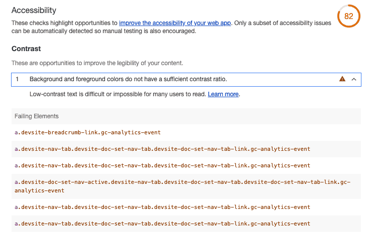
As you can see in the screenshot below, once you run Lighthouse, the generated reports in the accessibility section will contain the information about your website’s color contrast.
After analyzing a website with Google Lighthouse the tool will not only let you know that there is an insufficient contrast ratio between the background and foreground colors, but it will also notify you about the elements that have failed the audit so you can easily improve them.
How To Use Google Lighthouse To Check Your Color Contrast Ratio
If you are using the Google Chrome Browser, you can run Lighthouse very easily and without any download. Just open Chrome Developer tools by right-clicking on the page that you want to audit and select ‘Inspect’.
Alternatively, press Command+Option+C on Mac or Control+Shift+C on Windows. Click the ‘Audits’ tab and perform an audit. After you run an audit it will take around 1 minute to generate the report.
Another option is to run Lighthouse as a Chrome Extension. Simply install the Lighthouse Chrome Extension from the Chrome Webstore. Go to the page you want to analyze and click the Lighthouse extension. Then, click on ‘generate report’.
Optimal Color Contrast Ratio
Once you found out from the Lighthouse report that your webpages’ color contrast is insufficient, you should make us of this opportunity to improve your website.
The Ideal color contrast ratio between text and the background color is 4.5:1 for small text and 3:1 for larger text (above 18pt or 14pt bold). This ratio also applies to text on your images.
How To Get Your Color Contrast Ratio And Improvement Suggestions
Now, if you found out that the colors you use don’t satisfy the optimal color contrast ratio, how can you find colors that follow the optimal color contrast ratio?
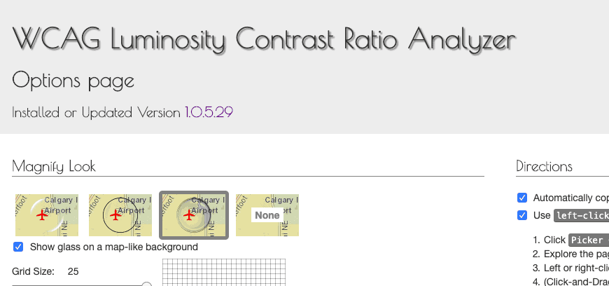
My recommendation is to use the WCAG Luminosity Contrast Ratio Analyzer Chrome Browser extension to find colors that satisfy the ideal ratio for your website. You can easily download it free from the Chrome Web Store.

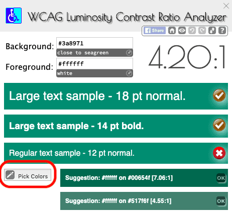
After downloading it, you will see the ‘options page’ with directions on how to use the extension correctly, so make sure to read them before using this tool. But if you want to start using it directly, simply go to the website you want to audit and click on the extension. Then you can easily check color contrast ratios from webpages by using the ‘pick colors’ button. Under the default setting, right-click the text to select the color and left-click the background.

If you are already aware of which elements are failing to satisfy the ideal ratio from running Google Lighthouse, using this tool will be very helpful for re-designing your webpages.
Once you picked the colors on your website that you want to check, for example a button and its button text, the extension will automatically give you suggestions on which colors to pick instead to assure better readability.
Conclusion
The accessibility of websites is regarded as an important ranking factor for Google. Small changes you make on text and background colors can improve your users’ experience, which eventually will benefit your website’s ranking and traffic.
So, do not miss out on this easy opportunity!
If you would like to read more on SEO audits, check out these related articles:
- How To Audit Your Website For Free With These Easy Steps
- How To Audit Your Site For Mobile SEO
- Top 6 Free SEO Auditing Tools For Your Website
- Basic SEO Guide


1 Comment
This really is a concern many bloggers tend to ignore. Colors shape user experience in many ways. I gave been to websites with black backgrounds and red texts and bounced off them inside ten seconds. Thanks for sharing this article and bring light to this issue.